Recently I made a poster for the Ladies Night Anthology Launch Party
(which will be super fun, BTW)
so I thought, just for kicks, I’d walk ya’ll through that process:
STEP ONE: Sketches.
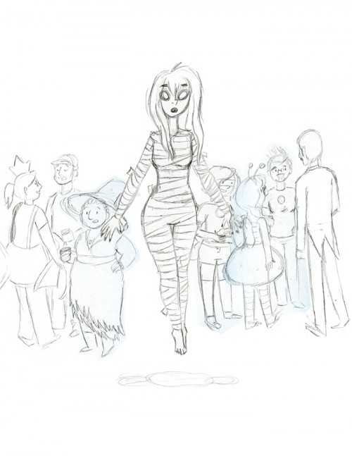
I sketched a few composition sketches, then a few character sketches, and finally I brought my favorite sketches into photoshop and laid them out like so:

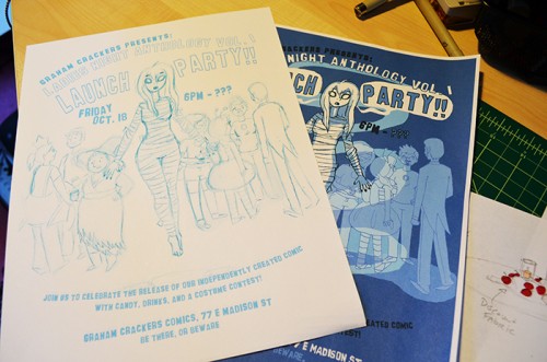
Then I turned my lines blue, and brought the sketch into illustrator to get busy with the text. I found a font I liked, and used my typography skills to make the text flow just the way I wanted. When I was satisfied I printed out my blue lines, which were now ready for inking:

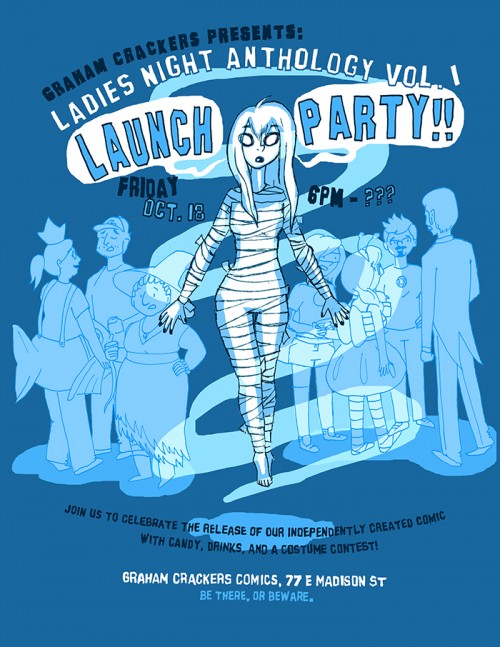
After inking I scanned it in black and white and did a quick color job where I added a few details.
After a test print at size (see above) I corrected a few small issues and then sent the final image off to promote our amazing party!:


Leave a Comment